02
Kōyō — Brand Identity
Concept — Branding, Print
CONCEPT
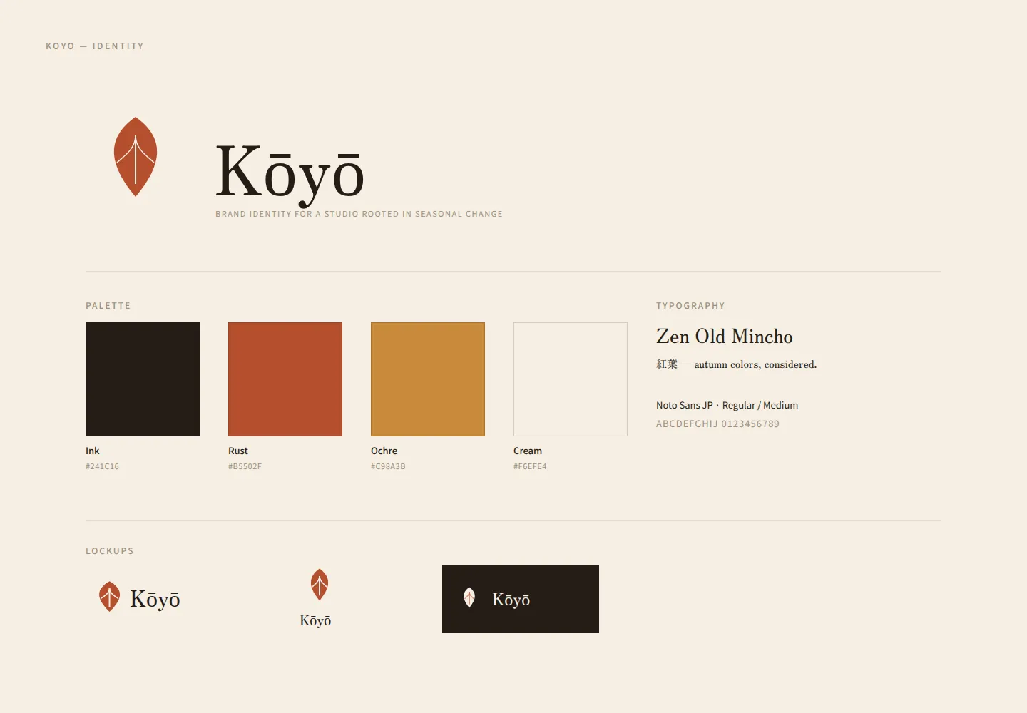
Kōyō is a concept identity for a small design studio named after the Japanese word for autumn foliage — the seasonal turning of leaves to red and gold. The mark and palette translate that idea into a quiet, repeatable system: a single folded-leaf symbol, a warm rust-and-ochre palette, and a serif tuned for both Latin and Japanese type.
SELF-REVIEW
This identity was designed as an exercise in restraint, and I think the mark and palette hold up well in isolation — the folded-leaf symbol is simple enough to reproduce at small sizes without losing its shape. What I haven't tested is durability: no real print run, no application beyond the two mockups shown here (stationery, packaging, signage), and no check of how the rust/ochre palette holds up under different print stocks or screen color profiles. Treat this as a concept, not a proven system.
Cover
Identity sheet
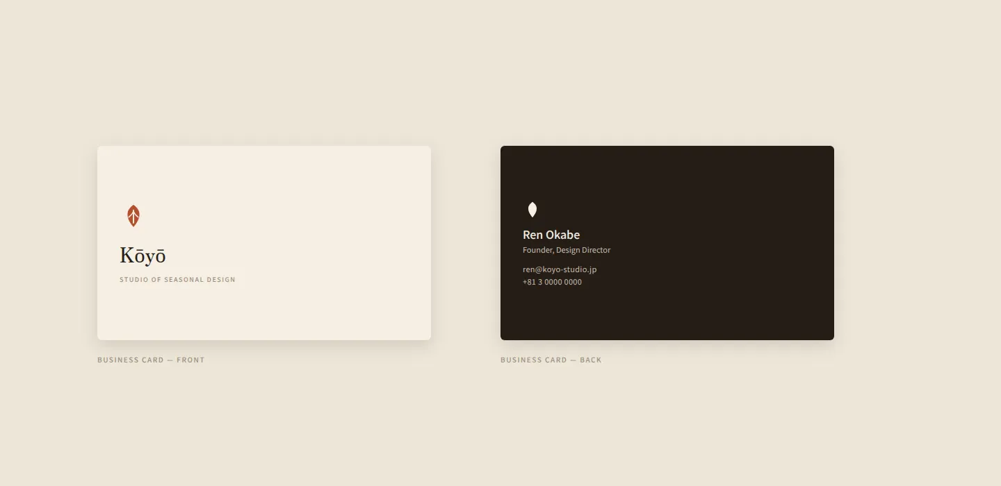
Business card
"A mark should hold still long enough to be remembered, and change little enough to be trusted."
NEXT PROJECT
Origami — Editorial App